https://myweb.fiu.edu/bjohn183/
Brooke’s website does a good job showcasing different assignments and projects from the course. It includes writing, media, and blog posts that give readers a strong sense of the author’s interests and writing style. The site is easy to navigate and has a clear purpose, although there are a few areas that could be improved.
Variety of Content
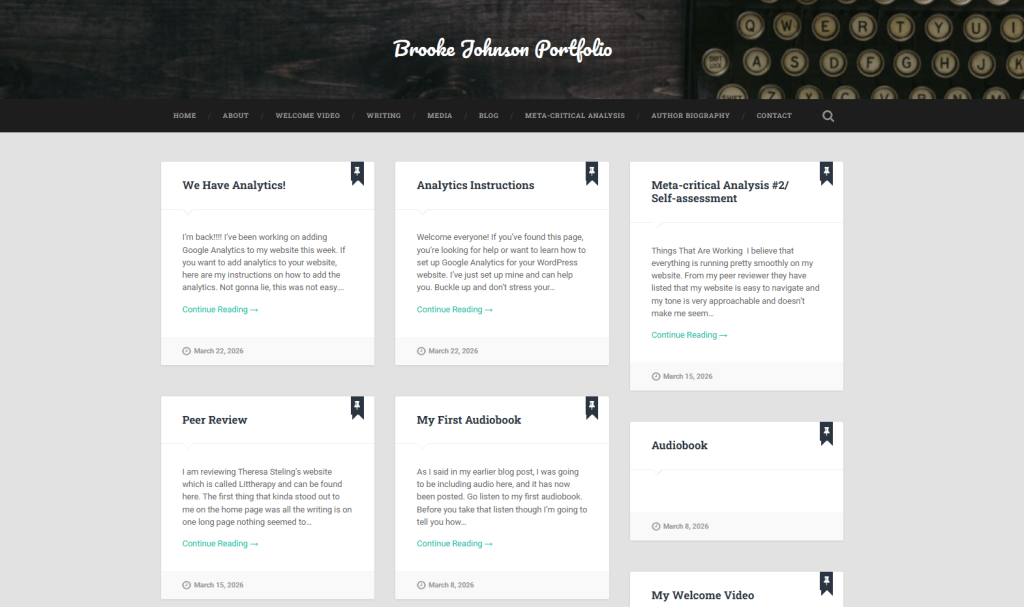
The website includes a wide range of content that reflects the work completed throughout the semester. On the homepage, there are posts like My First Audiobook, My Welcome Video, and My First Time in New Orleans. These posts combine writing and multimedia, which makes the portfolio more engaging.
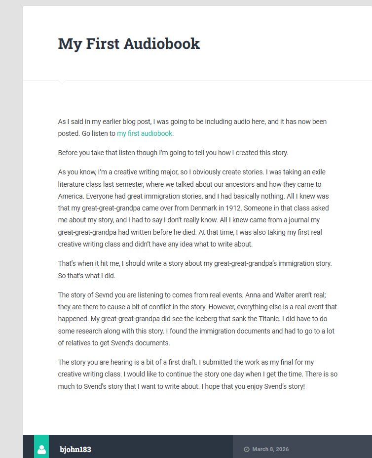
One of the most interesting posts is My First Audiobook. Brooke explains how she created a story based on her great-great-grandfather’s immigration story from Denmark in 1912. This makes the assignment feel more personal instead of just another class project. According to The Guardian, “Reveal more about who you are in your posts and your audience will love you for it,” which shows how personal storytelling helps connect with readers.
Another usability improvement would be adding more images across all posts. Some pages include visuals, but others rely mostly on text. The Blog Starter explains that writers should use headings and structure because “each main point becomes the heading for a different section.” Using this approach would make the site more organized and visually balanced.
Organization and Navigation

The About Statement clearly explains the purpose of the website. It mentions skills like copywriting, SEO awareness, and accessibility. This gives readers helpful context and explains what the author hopes to learn from the course.
The navigation bar also makes the site easy to use. Readers can quickly move between Home, About, Writing, Media, and Blog sections. Using headings and clear sections improves readability. The Blog Starter explains that “writing a blog post becomes much easier when you start with an outline… each main point becoming the heading for a different section.”
Areas for Improvement
There are a few areas that could make the website stronger:
- Some paragraphs are long and harder to scan
- A few pages are text-heavy
- More headings could improve readability
- Additional visuals would make posts more engaging
According to usability expert Jakob Nielsen, people usually scan websites instead of reading every word, so shorter paragraphs and more spacing can make content easier to read.
Overall Impression ⭐⭐⭐⭐
Overall, Brooke’s website is a strong student portfolio. It includes a good mix of writing, reflection, and multimedia content. The site is easy to navigate and communicates the author’s personality clearly. With a few improvements like shorter paragraphs, additional visuals, and more scannable formatting, the website could be even more engaging and easier for readers to use.

Leave a comment